| Author |
Topic |
|
Cannelle
Super Mod
Cred: 31 |
| Metal Overlord |
| Posts: |
54102 |
| Country: |
NL |
| PM: |
 |
| Ignore: |

|
| Connection: |

|
|
Reply Cred
|
|
Show Profile
|
|

 
|

|
05/21/2010
05:29:24 |
| Post Cred: 0 |
 
|
|
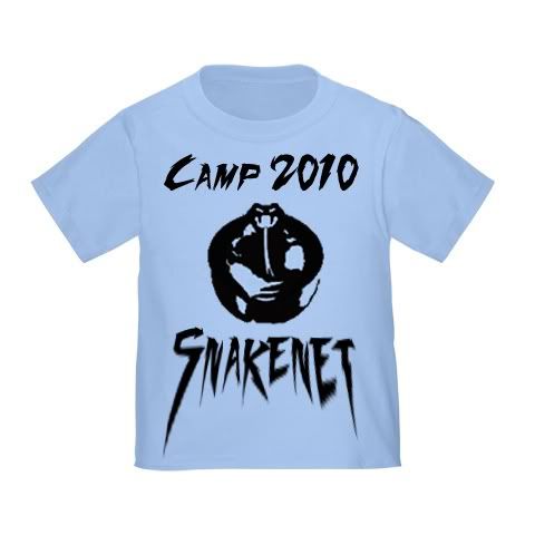
OK, I don't have time to wait to see if you're sending them or posting them, so I'm going to post Geoff's design for feedback in the meantime (he worked his ass off on it even tho he was busy with his exams, trying to respect the instructions, so it wouldn't be fair to let him hang too long)
for people who want to comment on the designs, please keep in mind what the MUST BE list was:
- Baby blue color for the shirt
- Unicolor design (Black), to keep the price reasonable
- Easily recognisable SnakeNet element (ideally, the official logo)
- Wacken element
- If it's too complex, it might not look good when printed
oh yeah and don't forget the important SnakeNet rule: SnakeNet is not a democracy, it's a benevolent dictatorship, so the final call will be made by those with powers  |
 
|
|
Cannelle
Super Mod
Cred: 31 |
| Metal Overlord |
| Posts: |
54102 |
| Country: |
NL |
| PM: |
|
| Ignore: |
|
| Connection: |
|
|
Reply Cred
|
|
Show Profile
|
|
|
|
|
05/21/2010
05:35:19 |
| Post Cred: 0 |
|
|
|
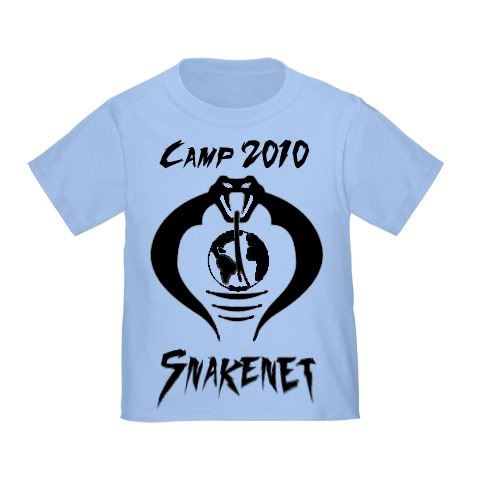
OK, so Geoff's second design:
FRONT
SnakeNet logo merged with the world (metal nation aspect)
BACK
(the drawing shows the front of a tshirt, but it will be the back) |
|
|
|
DeadDrunkDane
Cred: 21 |
| Gold Class |
| Posts: |
4827 |
| Country: |
DK |
| PM: |
|
| Ignore: |
|
| Connection: |
|
|
Reply Cred
|
|
Show Profile
|
|
|
|
|
05/21/2010
05:48:30 |
| Post Cred: 0 |
|
|
|
Rocking designs 
The polls are up. I put them in the MMP. |
|
|
|
Metal_Dem
Cred: 22 |
| Metal God |
| Posts: |
22742 |
| Country: |
BE |
| PM: |
|
| Ignore: |
|
| Connection: |
|
|
Reply Cred
|
|
Show Profile
|
|
|
|
|
05/21/2010
14:00:36 |
| Post Cred: 0 |
|
|
|
Geoff dude! you did a very good job.
I would ideally prefer official logo but this one is not bad too. |
|
|
|
ElDrugo
Cred: 3 |
| Metal God |
| Posts: |
19277 |
| Country: |
CH |
| PM: |
|
| Ignore: |
|
| Connection: |
|
|
Reply Cred
|
|
Show Profile
|
|
|
|
|
05/21/2010
14:35:46 |
| Post Cred: 0 |
|
|
|
| Great work! The front is awesome! |
|
|
|
vlier
Super Mod
Cred: 14 |
| Metal Goddess |
| Posts: |
38384 |
| Country: |
BE |
| PM: |
|
| Ignore: |
|
| Connection: |
|
|
Reply Cred
|
|
Show Profile
|
|
|
|
|
05/21/2010
15:20:26 |
| Post Cred: 0 |
|
|
|
quote:
Originally posted by Metal_Dem
Geoff dude! you did a very good job.
I would ideally prefer official logo but this one is not bad too.
It's the entire official logo but it's wrapped around the world.Compare and see for yourself 

|
|
|
|
Metal_Dem
Cred: 22 |
| Metal God |
| Posts: |
22742 |
| Country: |
BE |
| PM: |
|
| Ignore: |
|
| Connection: |
|
|
Reply Cred
|
|
Show Profile
|
|
|
|
|
05/21/2010
16:16:25 |
| Post Cred: 0 |
|
|
|
Now that you tell it, I see it.
I didn't notice at first sight. |
|
|
|
Thor Bear
Cred: 18 |
| Metal God |
| Posts: |
24761 |
| Country: |
DK |
| PM: |
|
| Ignore: |
|
| Connection: |
|
|
Reply Cred
|
|
Show Profile
|
|

|
|
|
05/22/2010
03:25:52 |
| Post Cred: 0 |
|
|
|
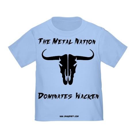
| I stiil think that a clear Snakenet logo is the best option. It might be boring but it's more recognizable and more clean. |
|
|
|
vlier
Super Mod
Cred: 14 |
| Metal Goddess |
| Posts: |
38384 |
| Country: |
BE |
| PM: |
|
| Ignore: |
|
| Connection: |
|
|
Reply Cred
|
|
Show Profile
|
|
|
|
|
05/22/2010
03:56:22 |
| Post Cred: 0 |
|
|
|
| Ok,I heard some comments on the frontside (Geoff can make the logo more visible if needed)but I didn't hear any on the backside.Wat do you think about the text or image.Should you pick another verb instead of "dominate" ,change it completely or let it be?.He can make the URL below bigger too because I think it's a bit too small myself.Discuss. |
|
|
|
Metal_Dem
Cred: 22 |
| Metal God |
| Posts: |
22742 |
| Country: |
BE |
| PM: |
|
| Ignore: |
|
| Connection: |
|
|
Reply Cred
|
|
Show Profile
|
|
|
|
|
05/22/2010
04:32:34 |
| Post Cred: 0 |
|
|
|
quote:
Originally posted by vlier
Ok,I heard some comments on the frontside (Geoff can make the logo more visible if needed)but I didn't hear any on the backside.Wat do you think about the text or image.Should you pick another verb instead of "dominate" ,change it completely or let it be?.He can make the URL below bigger too because I think it's a bit too small myself.Discuss.
Nancy, the back side is perfect.
here, i think that 'dominate' suits well snakenet gathering
oh and yes, the url might be a lil bigger tho
|
Edited by - Metal_Dem on 05/22/2010 04:33:57
|
|
|
|
Dr03hn3r
Cred: 0 |
| Silver Class |
| Posts: |
1213 |
| Country: |
DE |
| PM: |
|
| Ignore: |
|
| Connection: |
|
|
Reply Cred
|
|
Show Profile
|
|
|
|
|
05/22/2010
05:29:40 |
| Post Cred: 0 |
|
|
|
I like the design very much It's awesome. But what about the names of the members on the back so the shirts are a bit more personalized? It's awesome. But what about the names of the members on the back so the shirts are a bit more personalized? |
|
|
|
vlier
Super Mod
Cred: 14 |
| Metal Goddess |
| Posts: |
38384 |
| Country: |
BE |
| PM: |
|
| Ignore: |
|
| Connection: |
|
|
Reply Cred
|
|
Show Profile
|
|
|
|
|
05/22/2010
05:41:17 |
| Post Cred: 0 |
|
|
|
quote:
Originally posted by Dr03hn3r
I like the design very much It's awesome. But what about the names of the members on the back so the shirts are a bit more personalized?
I'm not sure but I think Nina was going to make nametags for everyone.Names on the backside are cool but then the image of the bull has to go and the shirt has no wacken element anymore.Besides,that's up to the higher powers to decide 
|
|
|
|
Cannelle
Super Mod
Cred: 31 |
| Metal Overlord |
| Posts: |
54102 |
| Country: |
NL |
| PM: |
|
| Ignore: |
|
| Connection: |
|
|
Reply Cred
|
|
Show Profile
|
|
|
|
|
05/22/2010
06:04:39 |
| Post Cred: 0 |
|
|
|
nah nothing needs to go if we add a customized item, it could for example be between the "dominates Wacken" and the URL
but I like I said, that's nothing certain, it depends on a lot of things, so better not make it a priority |
|
|
|
vlier
Super Mod
Cred: 14 |
| Metal Goddess |
| Posts: |
38384 |
| Country: |
BE |
| PM: |
|
| Ignore: |
|
| Connection: |
|
|
Reply Cred
|
|
Show Profile
|
|
|
|
|
05/22/2010
06:51:19 |
| Post Cred: 0 |
|
|
|
quote:
Originally posted by Cannelle
nah nothing needs to go if we add a customized item, it could for example be between the "dominates Wacken" and the URL
but I like I said, that's nothing certain, it depends on a lot of things, so better not make it a priority
Yeah one name is no prob of course but I thought he wanted all the names on the back like a few years ago
|
|
|
|
Sortiment
Moderator
Cred: 32 |
| Metal God |
| Posts: |
33963 |
| Country: |
DK |
| PM: |
|
| Ignore: |
|
| Connection: |
|
|
Reply Cred
|
|
Show Profile
|
|
|
|
|
05/22/2010
06:55:31 |
| Post Cred: 0 |
|
|
|
| It was actually quite cool with all the names and countries on the back, I miss that a bit |
|
|
|
Dr03hn3r
Cred: 0 |
| Silver Class |
| Posts: |
1213 |
| Country: |
DE |
| PM: |
|
| Ignore: |
|
| Connection: |
|
|
Reply Cred
|
|
Show Profile
|
|
|
|
|
05/22/2010
06:55:52 |
| Post Cred: 0 |
|
|
|
| nono just thought of one name so everyone gets his "own" shirt |
|
|
|
Cannelle
Super Mod
Cred: 31 |
| Metal Overlord |
| Posts: |
54102 |
| Country: |
NL |
| PM: |
|
| Ignore: |
|
| Connection: |
|
|
Reply Cred
|
|
Show Profile
|
|
|
|
|
05/22/2010
08:47:45 |
| Post Cred: 0 |
|
|
|
OK posting this in a hurry so it'll be quick.
Geoff's reworked the design a bit (THANKS!) so the logo is more recognizable.
He also did the back so that you can see how it *would* look *if we had time to customized the shirts*
Again, it's no certainty.
FRONT
BACK
Geoff, you should have done the example with your own name really |
|
|
|
so_says_the_phoenix
Cred: 5 |
| SnakeNet Hierophant |
| Posts: |
14432 |
| Country: |
US |
| PM: |
|
| Ignore: |
|
| Connection: |
|
|
Reply Cred
|
|
Show Profile
|
|
|
|
|
05/22/2010
08:50:42 |
| Post Cred: 0 |
|
|
|
| Above and beyond! I love! |
|
|
|
Delirium Tremens
Moderator
Cred: 29 |
| Metal Overlord |
| Posts: |
70163 |
| Country: |
BE |
| PM: |
|
| Ignore: |
|
| Connection: |
|
|
Reply Cred
|
|
Show Profile
|
|
|
|
|
05/22/2010
09:04:34 |
| Post Cred: 0 |
|
|
|
I like the second design a lot better I'm not too fond of the font used for "Camp 2010 - SnakeNet" and "The Metal Nation Dominates Wacken" though. Would it be possible to try out a few other ones?
Also, perhaps "SnakeNet" could be put above and "Camp 2010" under the logo, because then "SnakeNet" would be more visible, also when you sit down. |
|
|
|
vlier
Super Mod
Cred: 14 |
| Metal Goddess |
| Posts: |
38384 |
| Country: |
BE |
| PM: |
|
| Ignore: |
|
| Connection: |
|
|
Reply Cred
|
|
Show Profile
|
|
|
|
|
05/22/2010
09:12:25 |
| Post Cred: 0 |
|
|
|
quote:
Originally posted by Delirium Tremens
I like the second design a lot better I'm not too fond of the font used for "Camp 2010 - SnakeNet" and "The Metal Nation Dominates Wacken" though. Would it be possible to try out a few other ones?
Also, perhaps "SnakeNet" could be put above and "Camp 2010" under the logo, because then "SnakeNet" would be more visible, also when you sit down.
He used that font on the front and back because it looks a bit creepy(a snake is a bit like that)I saw him try a lot of others and it was not pretty at all.If you have any suggestions about the text for the backside feel free to post them because he ran out of inspiration atm Of course snakenet and camp 2010 could be switched if necessary
|
|
|
|
Dr03hn3r
Cred: 0 |
| Silver Class |
| Posts: |
1213 |
| Country: |
DE |
| PM: |
|
| Ignore: |
|
| Connection: |
|
|
Reply Cred
|
|
Show Profile
|
|
|
|
|
05/22/2010
10:36:18 |
| Post Cred: 0 |
|
|
|
| i like the last design really much Thumbs up |
|
|
|
Metal_Dem
Cred: 22 |
| Metal God |
| Posts: |
22742 |
| Country: |
BE |
| PM: |
|
| Ignore: |
|
| Connection: |
|
|
Reply Cred
|
|
Show Profile
|
|
|
|
|
05/22/2010
11:04:40 |
| Post Cred: 0 |
|
|
|
wow, the last design is very nice. thumbs up.
Geoff, you rule |
|
|
|
Cavemans Lady
Cred: 3 |
| Metal Goddess |
| Posts: |
32035 |
| Country: |
US |
| PM: |
|
| Ignore: |
|
| Connection: |
|
|
Reply Cred
|
|
Show Profile
|
|
|
|
|
05/22/2010
15:22:24 |
| Post Cred: 0 |
|
|
|
| Love it! Love it!! Love it!!! |
|
|
|
bloodletting
Cred: 5 |
| Platinum Class |
| Posts: |
9720 |
| Country: |
CA |
| PM: |
|
| Ignore: |
|
| Connection: |
|
|
Reply Cred
|
|
Show Profile
|
|
|
|
|
05/22/2010
15:47:05 |
| Post Cred: 0 |
|
|
|
| I love it also! its pretty much the best! |
|
|
|
Brack
Super Mod
Cred: 52 |
| Snakenet Support Staff |
| Posts: |
73080 |
| Country: |
DE |
| PM: |
|
| Ignore: |
|
| Connection: |
|
|
Reply Cred
|
|
Show Profile
|
|
|
|
|
05/22/2010
17:07:08 |
| Post Cred: 0 |
|
|
|
| That last design is great |
|
|
|
|
|
Topic |
|

